top picks.
Reducing the noise of our results page through leveraging products that users actually wanted to see.
the brief problem.
Our users could get up to 90+ results when searching for a credit card, with no indication on what was the best one for their needs.
micro summary.
Role: Designer from idea conception to release
Timeline: 2025
Platforms: Mobile and Web
outcomes.
[Design currently going through release]
THE PROBLEM
Our users could get up to 90+ results when searching for a credit card, with no indication on what was the best one for their needs.
what users said.
User testing always revealed that users wanted to compare products and know the ‘best of the bunch’, but comparison tools had previously tested poorly with users.
what data said.
The amount of searches in our Marketplace was increasing, but conversion wasn’t. The funnel was bigger, but the experience did not accommodate users needs.
what we said.
80% of searches came from our users we labelled as ‘always on the lookout’ or ‘assessing their options’. These users obsessively searched, but rarely took out a product.
THE SOLUTION
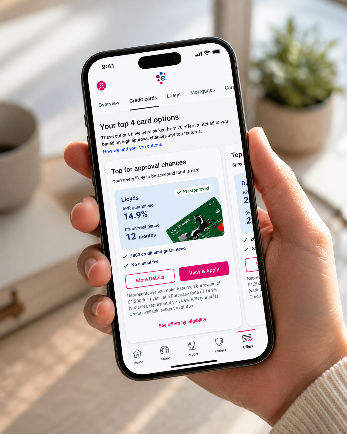
To leverage a users top options that are best suitable for repayments, purchases, balance transferring or chance of approval.
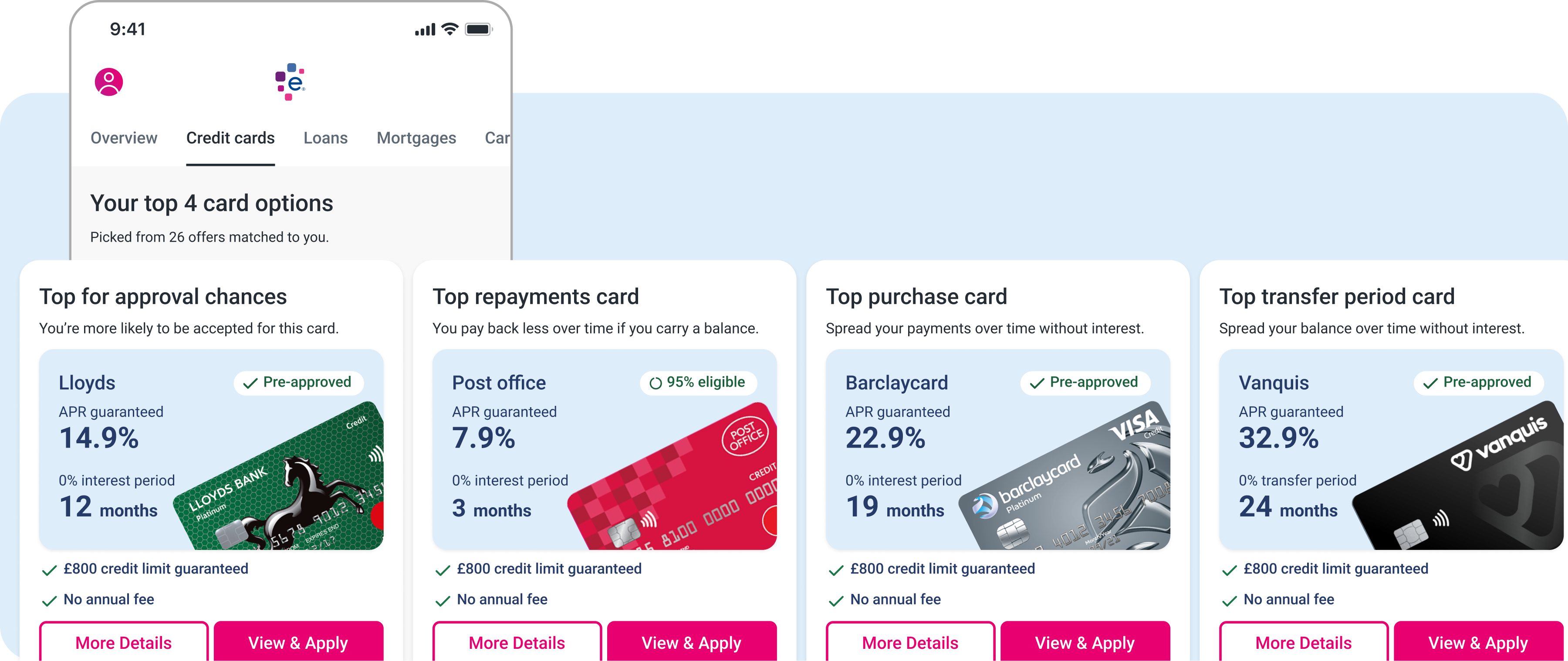
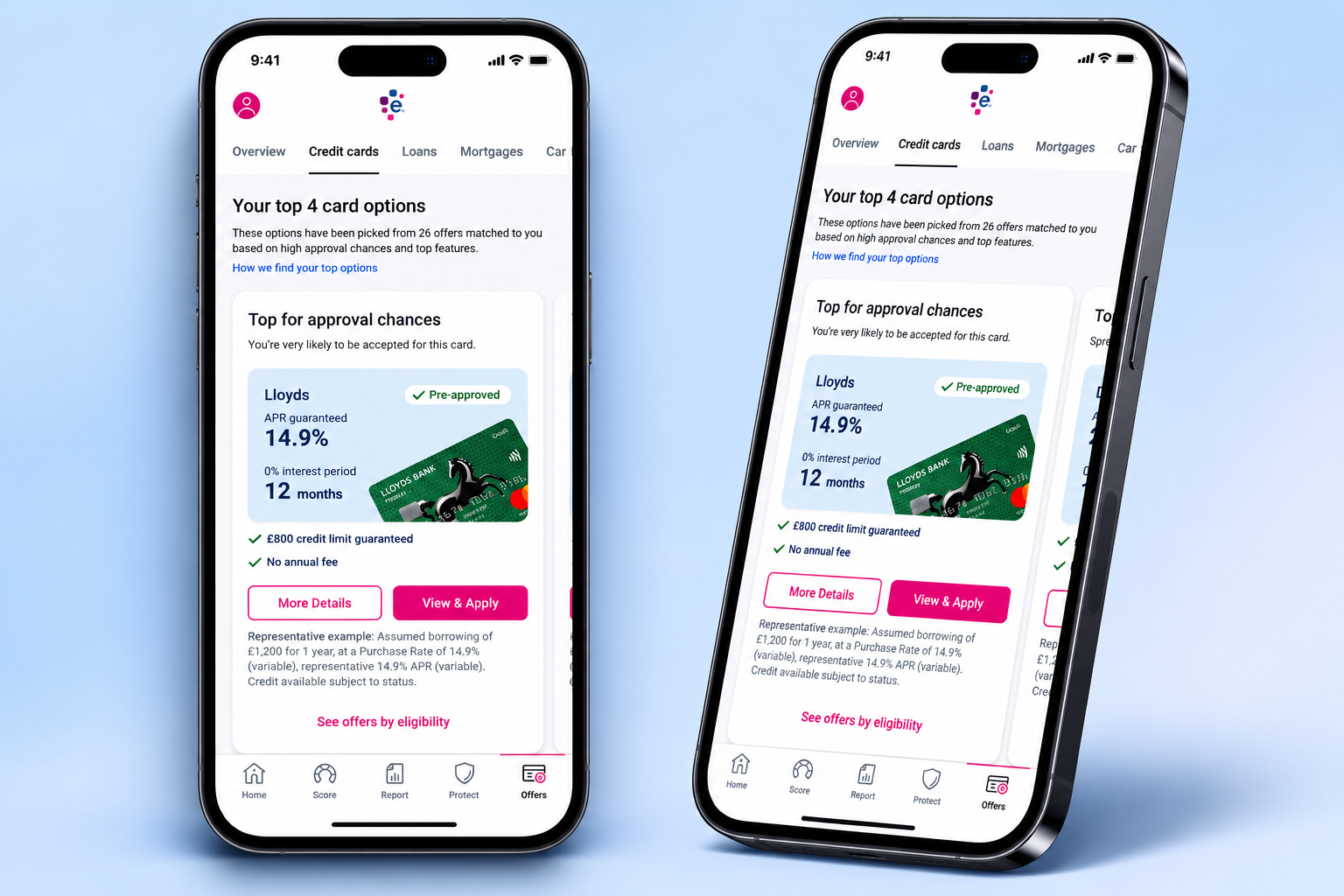
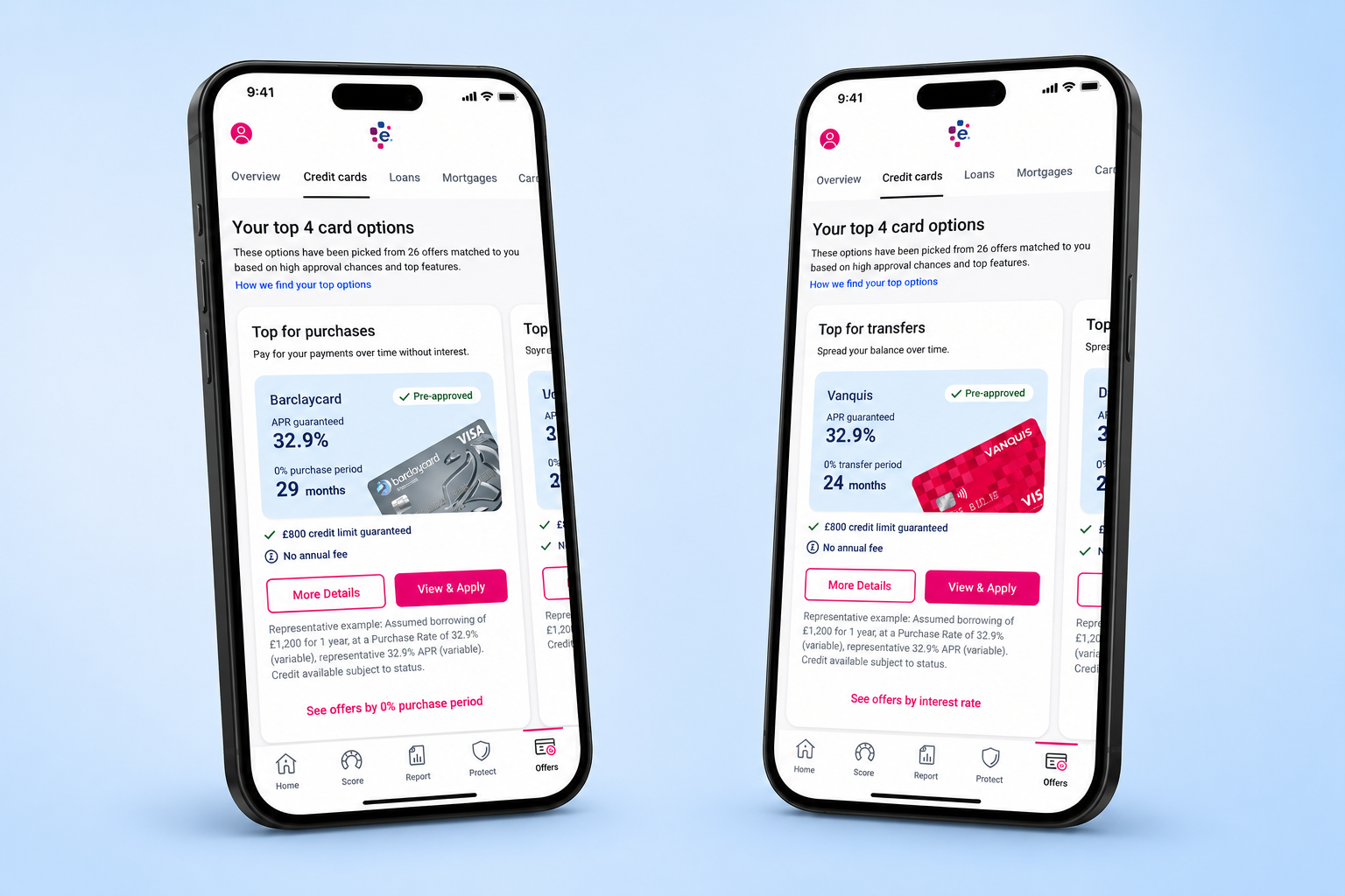
it entered.
Top Picks is an interstitial page that comes after the user has completed the form journey, but before the user is overwhelmed with all their results.
it explained.
Off the back of research testing with a panel of ‘lived experts’ in financial impairments, we learnt how vital it was to explain why the top options were good for the user.
it personalised.
CTAs allowed the user to either pick the best option by a type of card, or see their results ranked by that card type - allowing the user to personalise their results easily.
THE OUTCOME
Your whole results page at a glance.
[Where this worked]
Top Picks allowed users to either define or obtain their credit card solution in just the click of a button. Through meticulous research, we focused the solution on explaining why cards are a users top option, and why the user could benefit from a card like that. We worked with financial charity experts and lived experts who experience various disabilities or financial troubles to define exactly what they need in a comparison experience.
[What could’ve gone better]
Legal and compliance restraints, as well as a Panorama done by the BBC on Experian just before the release, meant we needed to be iron tight on explaining that we are not recommending cards to users - but instead giving a helping hand on picking their best options.
But this was only the tip of the iceberg..
Want to chat about this some more? I’d be more than happy to:
DM me on LinkedIn
See other projects